Angelswing

Building a scalable UX foundation for a rapidly evolving construction platform

My Role
Solo UX Designer
Duration
1+ year
Focus
Design Systems · Design Documentation · Research · Hotjar Analytics · Prototyping · Design QA · Sprint Planning · Stakeholder Alignment
  • ~70%

    fewer 1:1 design handoff meetings

  • 3 systemic changes

    Design system, handover, sprint rhythms

  • Unified

    shared language across design, dev and QA

Outgrowing its foundations

The product moved fast. Its shared design language didn’t.

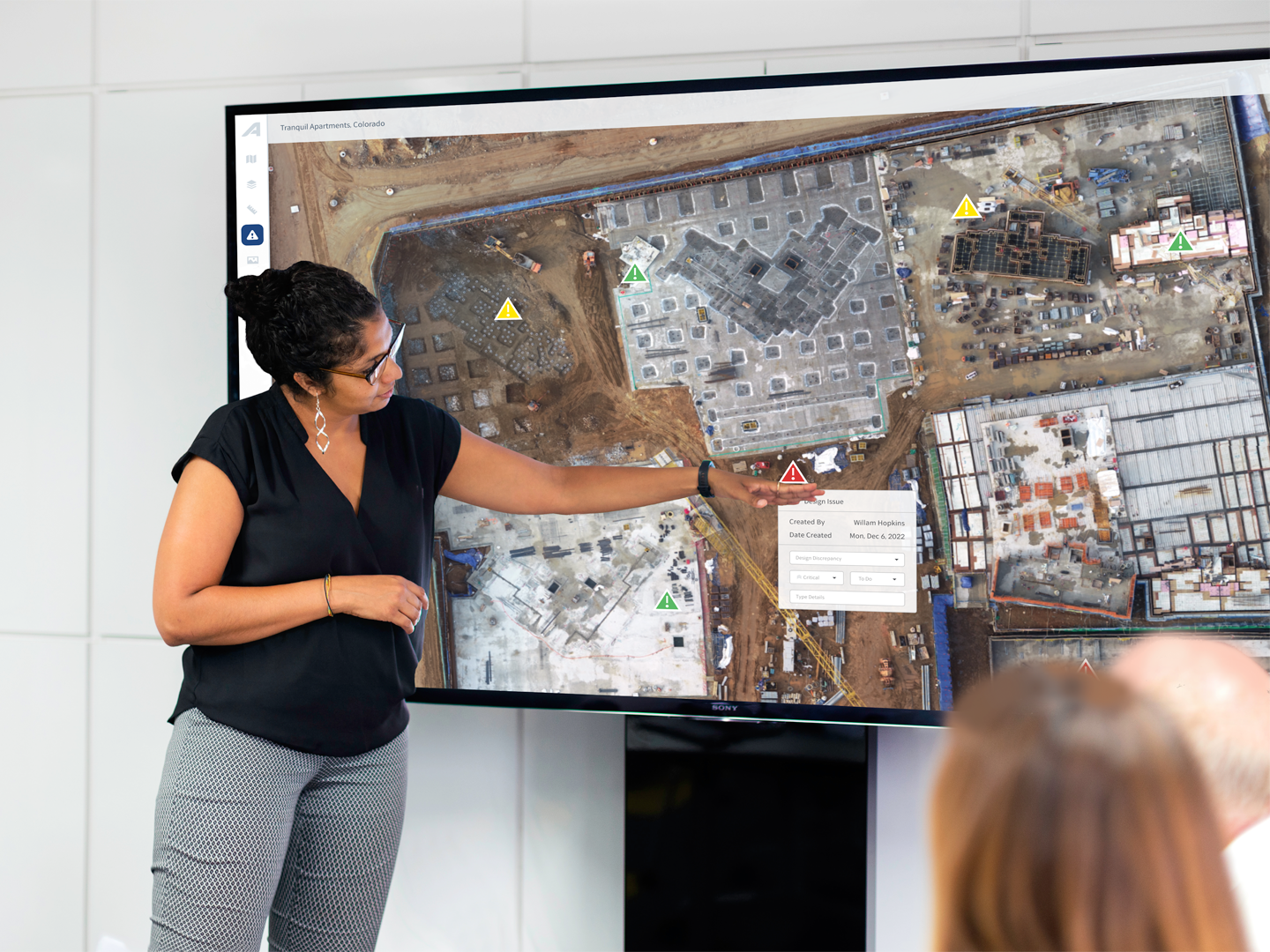
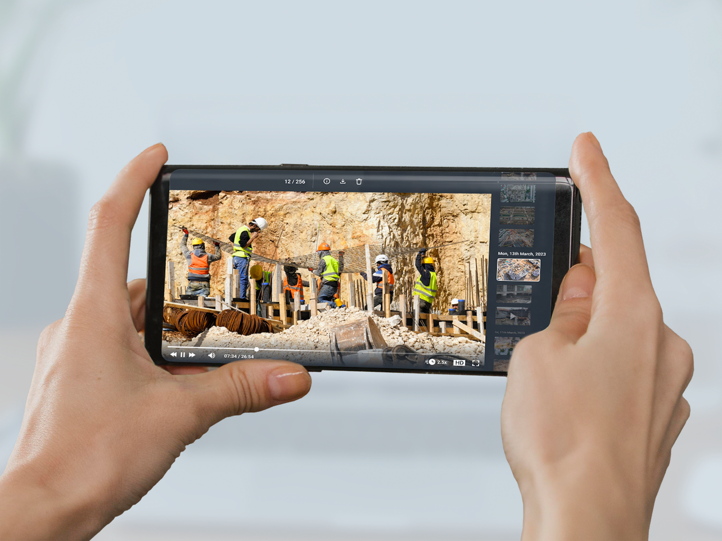
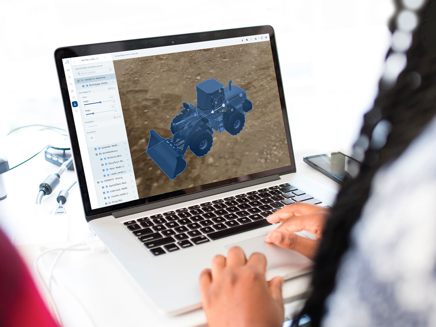
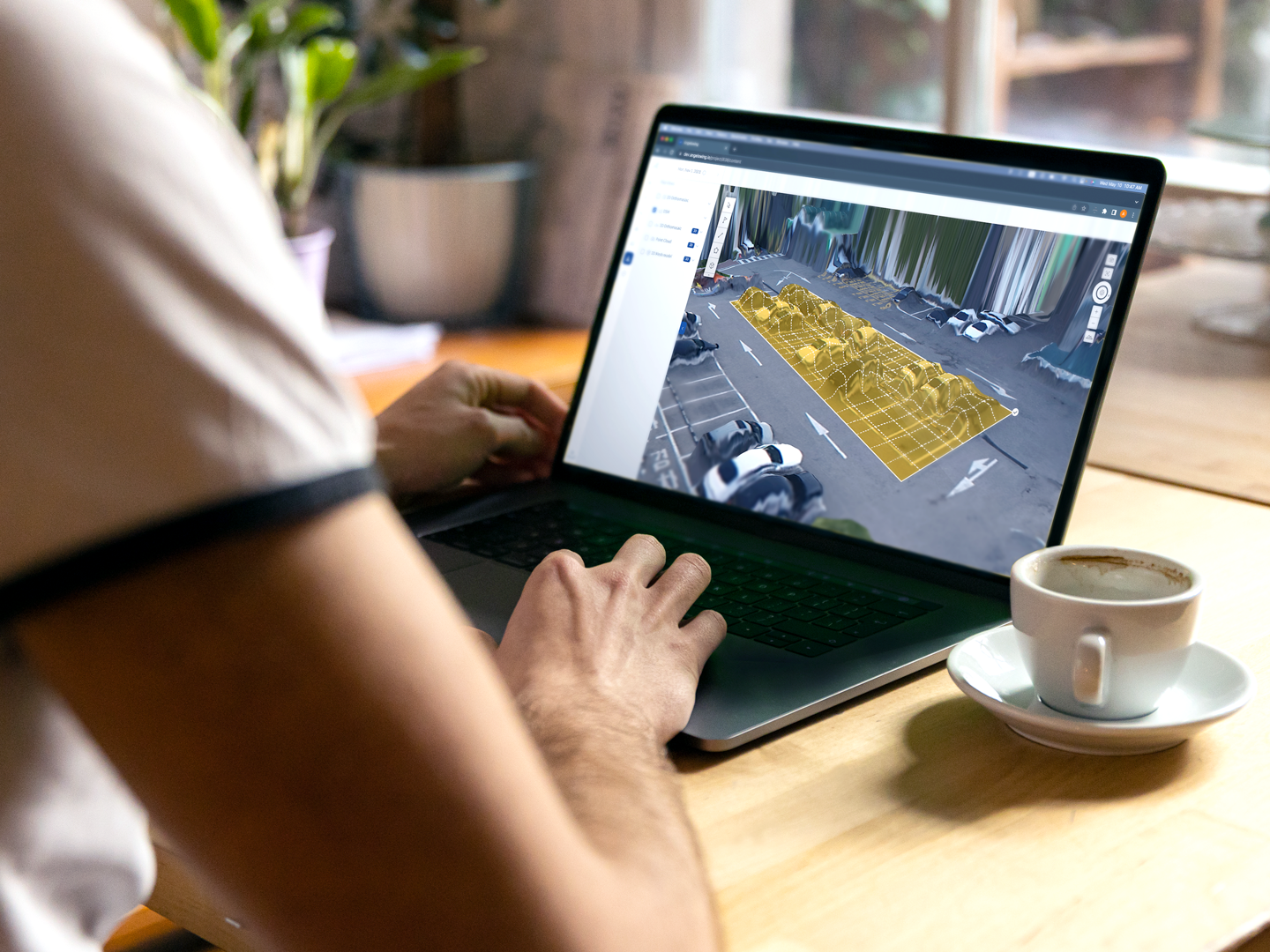
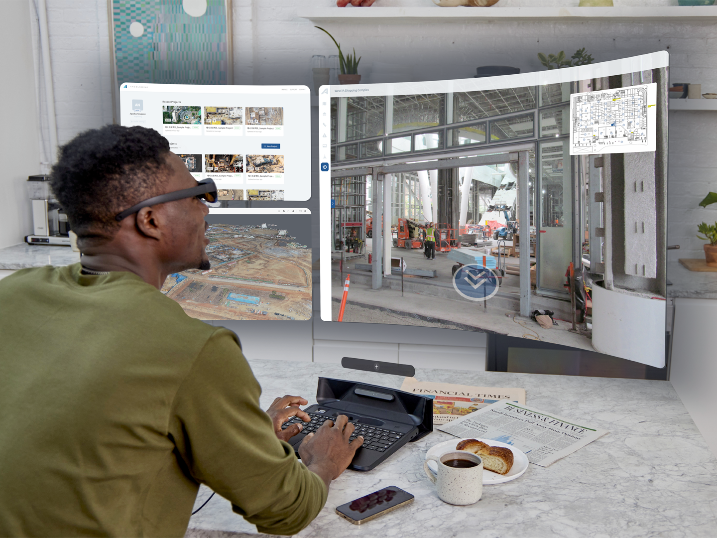
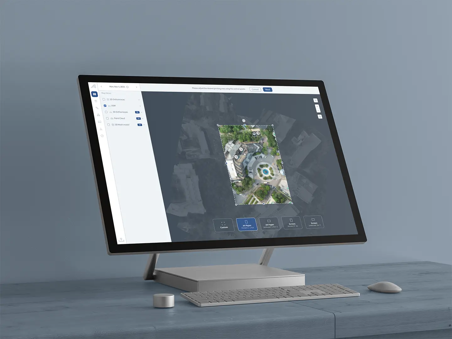
Angelswing builds digital representations of construction sites. New features shipped continuously, and the product had outgrown its original design foundations. My task wasn’t a redesign, but improving an evolving product without slowing it down.
Three cracks

Inconsistent patterns • Knowledge held by individuals • Handoffs that needed walkthroughs

Components and states had grown feature by feature. Design decisions and edge cases were mostly understood through conversations with the people who had built them. Handoffs often needed detailed walkthroughs and developer 1:1s, and small changes could have unintended effects because the Figma files lacked a robust component structure.

Evidence before fixes

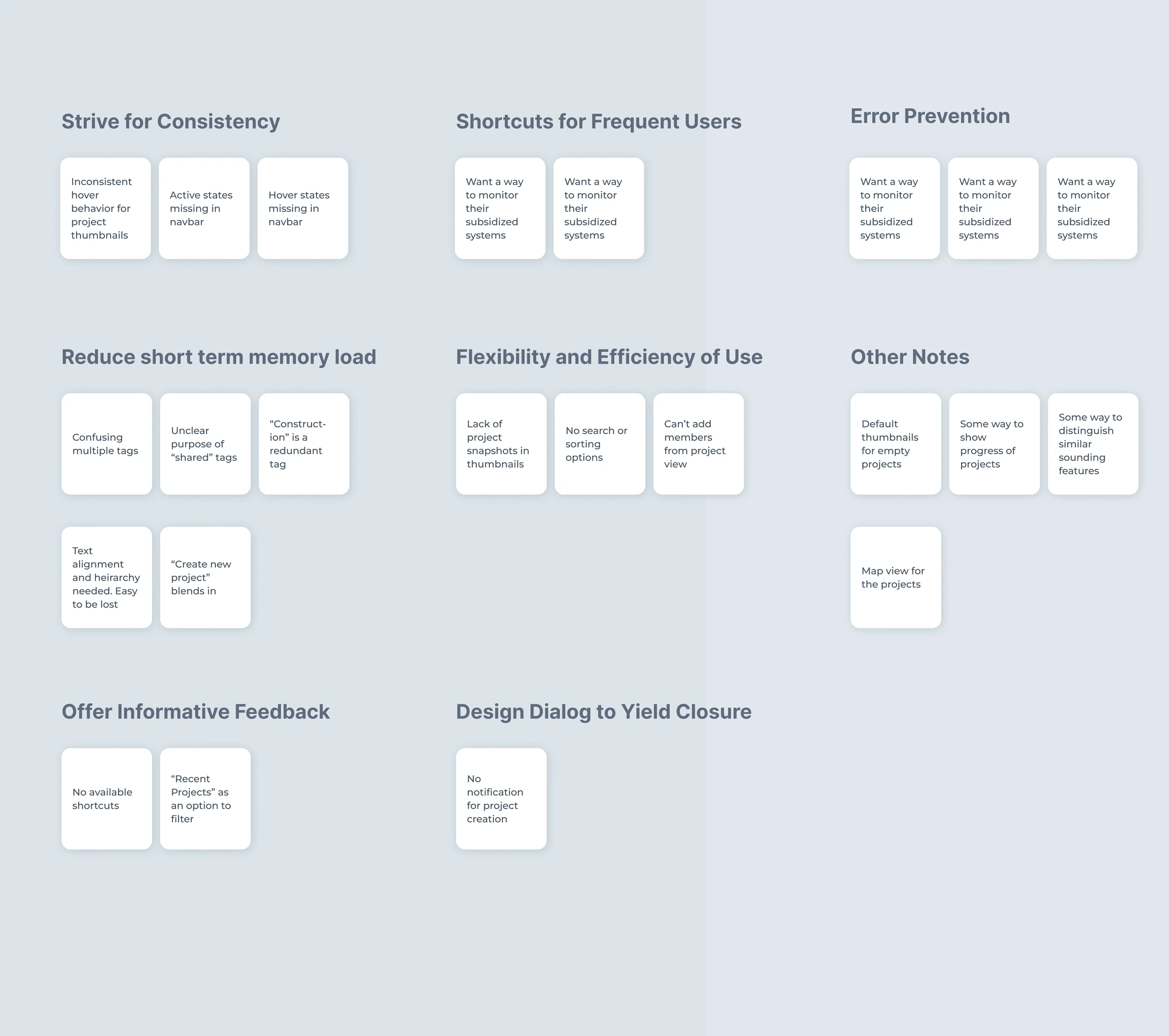
Sticky notes grouped by usability heuristic

Four sources told me what to fix first.

  • Heuristic review: showed that the inconsistencies went beyond visuals. Similar interactions behaved differently, error states weren’t consistently defined, and some edge cases had never been designed.
  • Hotjar and analytics: showed where people actually used the product, so I could prioritize by behavior.
  • User and sales conversations: revealed a need to tag, annotate, assign and communicate back to field workers, while structuring existing information better.
  • Competitive analysis: moved the question from “what’s missing?” to “how should this behave as a system?”

Reworked for tablets in the field

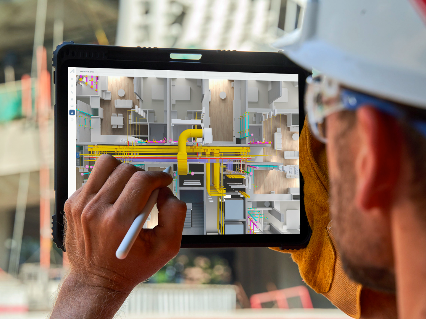
A site engineer using the platform on a tablet with a stylus

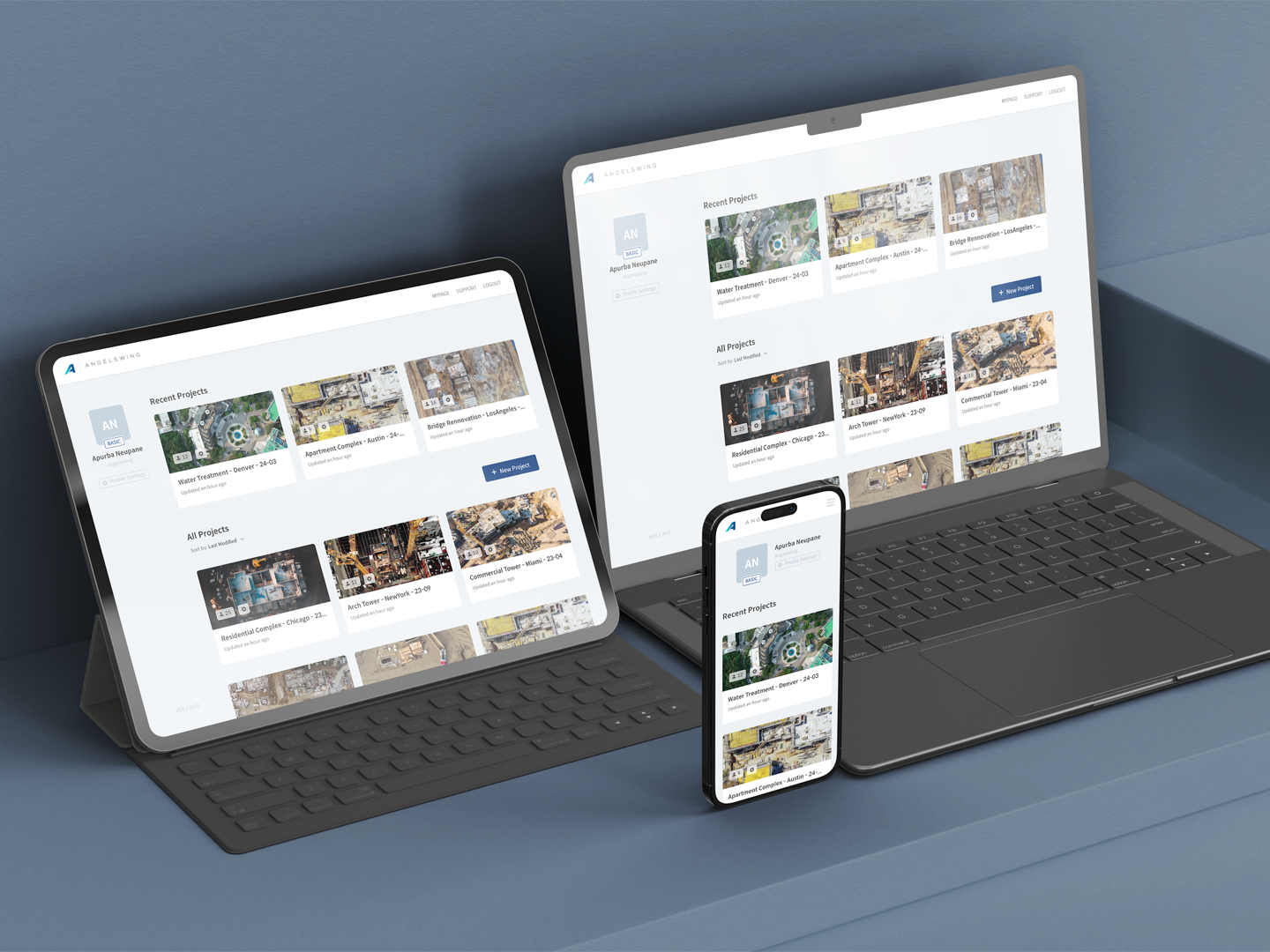
A large share of usage happened on tablets, but previous designs assumed a desktop.

The sales team’s insight changed how I approached touch targets, interaction density and several existing workflows. But of course, there were desktop users as well. It was important not to alienate either group.

A system, built while shipping

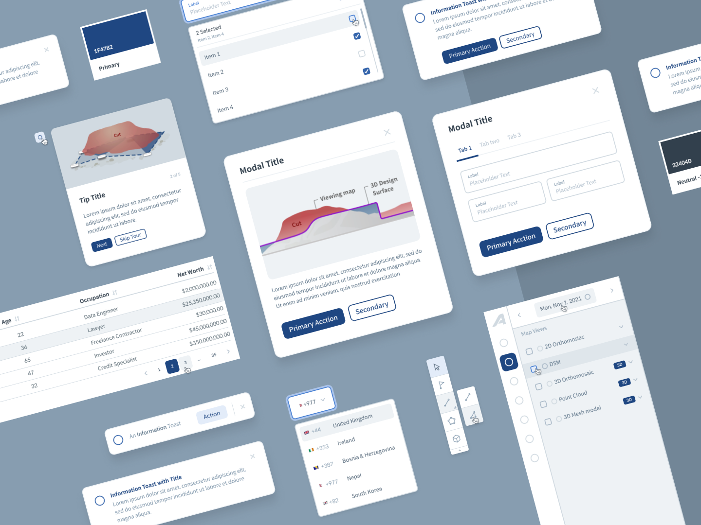
Components from the design system

I built the foundation alongside feature work, with developers in the room.

When I first joined the team, I was working off product screenshots to mock up new designs. But rather than pausing delivery, I gradually developed a Figma library of components and patterns while consulting developers on feasibility, behavior, reuse and constraints. The PO contributed their knowledge of existing best practices to the handover documentation, so the system became a shared working model.

Conversations slowly shifted from “How should this button look?” to “What should this component do in this state?”

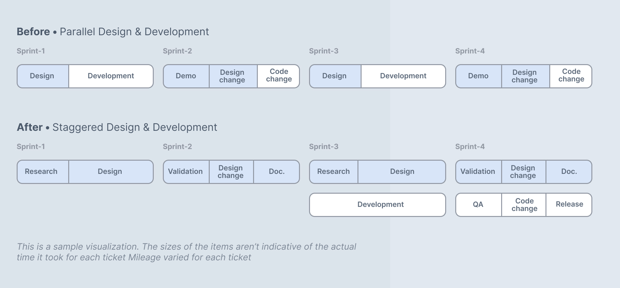
Design, one sprint ahead

Before and after: parallel versus staggered design and development sprints

Questions got answered before development started.

A design sprint ahead of development gave the team time to explore requirements, prototype, document decisions and align with stakeholders who had relevant information about the changes. Involving QA in backlog planning and design QA created a clearer path.

Requirement → design → verification → development → QA.

70% fewer handoff meetings

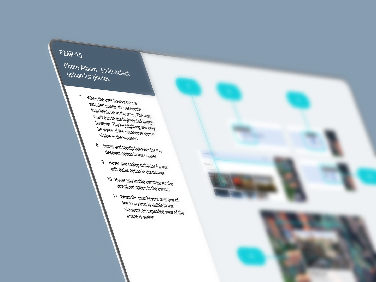
A page of the handover documentation

Shared knowledge replaced repeated walkthroughs.

One-to-one design handoffs dropped by roughly 70% in later sprints. Developers reused components, QA had a reference to check production against, and decisions no longer depended on one person. By the end, the process was mature enough to support additional designers. These are operational and qualitative outcomes. I haven’t claimed effects on revenue, conversion or velocity, because, frankly, they weren’t measured.

Knowing what to solve later

A feature request is rarely the whole problem.

Tagging involved assignment and status, media needed chronology, and 3D needed staged ambition. Good product design means understanding the system around the interface, solving what’s needed now, and giving the team enough structure to keep moving.