My Emotions Matter

From valuable but hard-to-explain services to a website and brand that speak to businesses, schools and individuals

My Role
Solo Designer · Visual Design Consultant
Duration
2 months
Focus
Website Redesign · Visual Strategy for Content · Creative Direction · Social Media Templates
  • 3 audiences

    ordered by who buys

  • Self-serve

    templates and guidelines the team uses on its own

  • Better leads

    client-reported, alongside less back-and-forth

Valued, but hard to explain
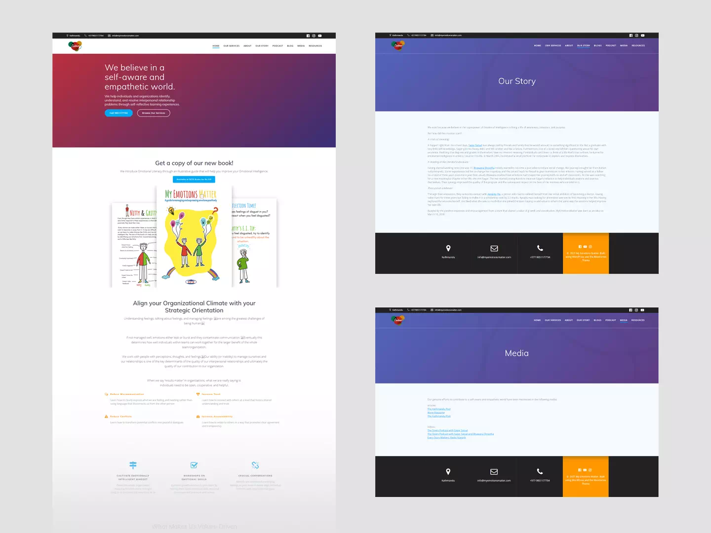
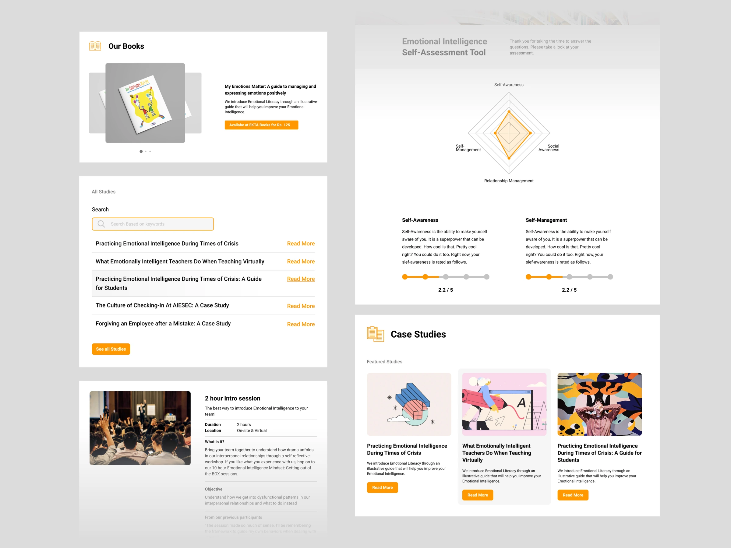
Pages of the old website

Clients understood the value. The website couldn’t explain it.

My Emotions Matter teaches emotional intelligence through workshops, courses and consulting. It was shifting towards more business work and needed a more professional site to build trust. The challenge wasn’t the quality of the work. It was saying clearly what they do and how.
Serious enough, warm enough

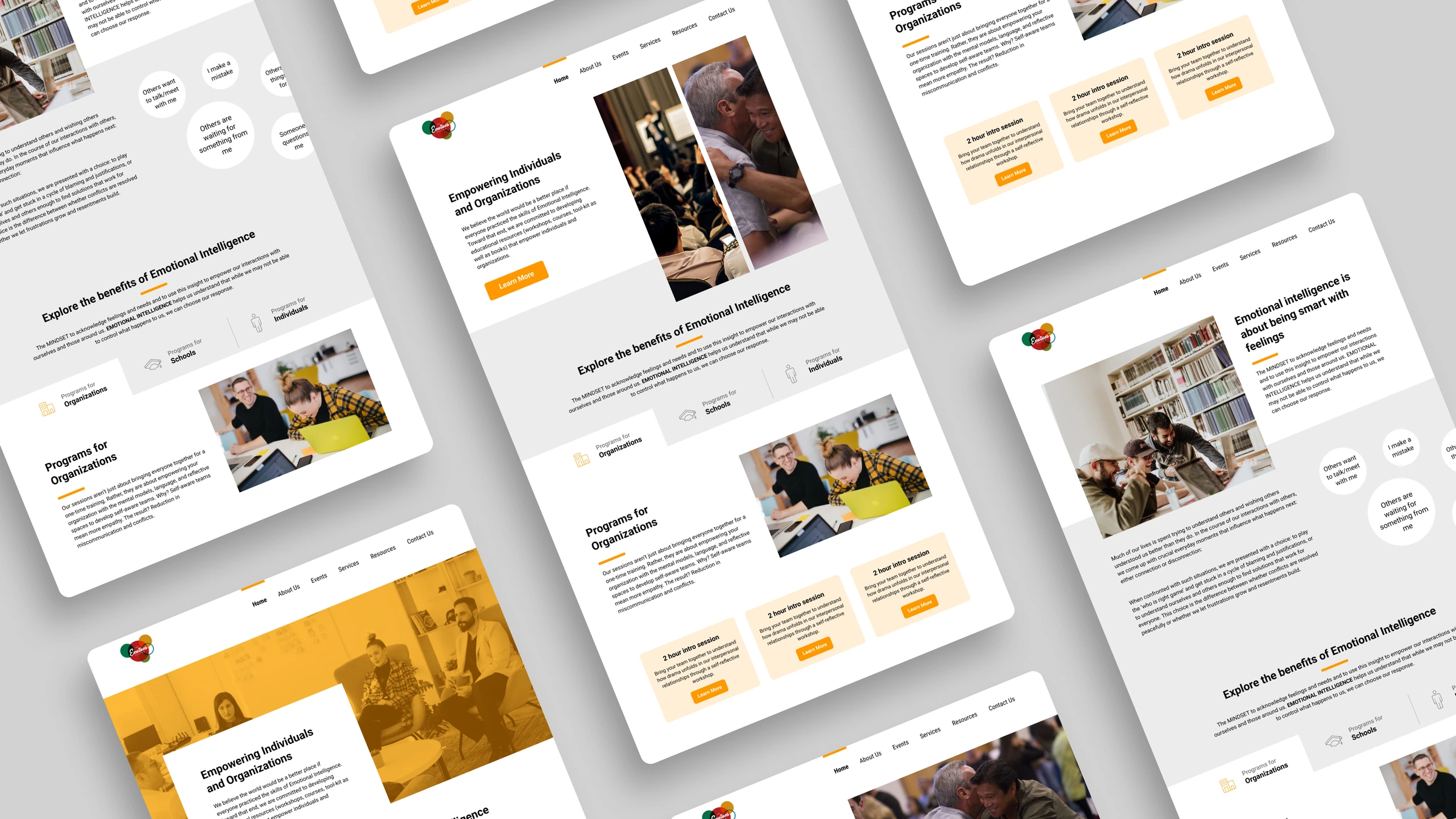
One visual language had to work for a boardroom and a classroom.

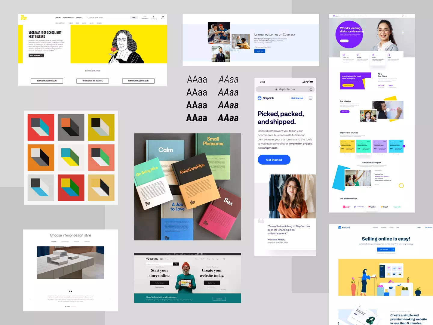
Competitive research and mood boards helped settle on a look that felt professional for businesses and approachable for schools and individuals. I also set the titles on the landing page, which gave the rest of the site its voice and structure.

Three buyers, three paths

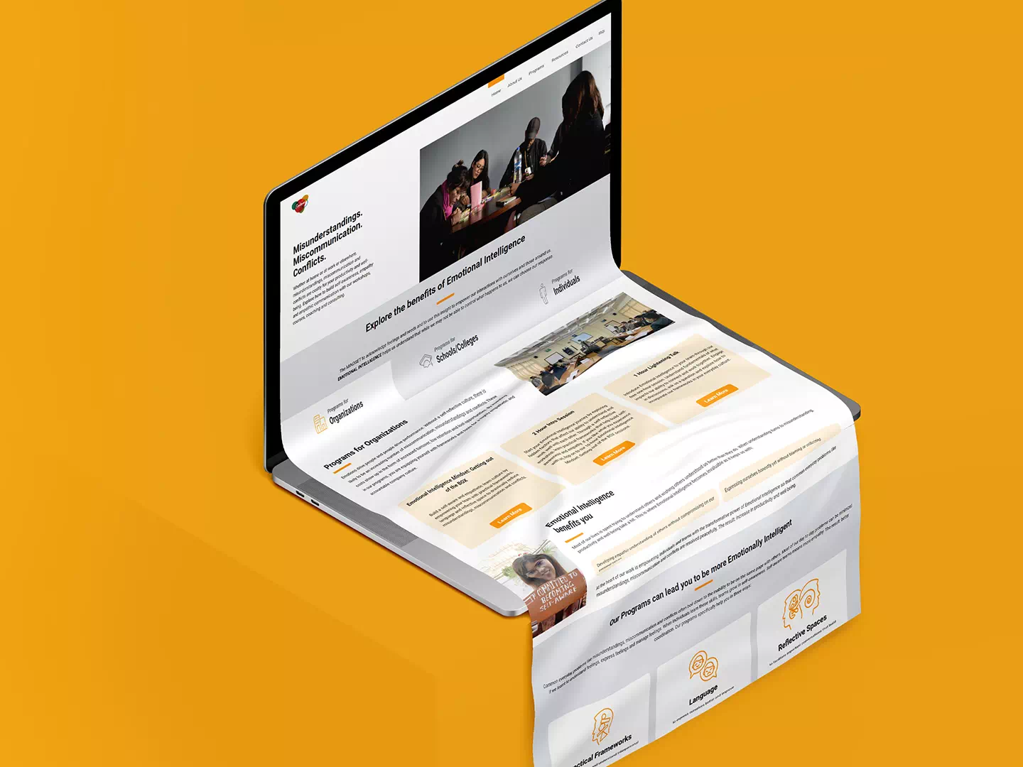
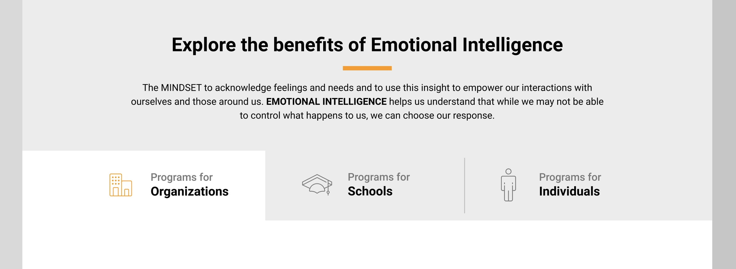
Three paths: programs for organizations, schools and individuals

Businesses, schools and individuals came for different reasons, so each got its own clear path.

A single general message would have served none of them well. The landing page draws a clear line between the offers for each group. Businesses were the main buyers, then schools, then individuals, so the page follows that order.

Who is buying, and what do they need to see first?

Built to run without me

The website became the place every post leads back to, and the team could post on their own.

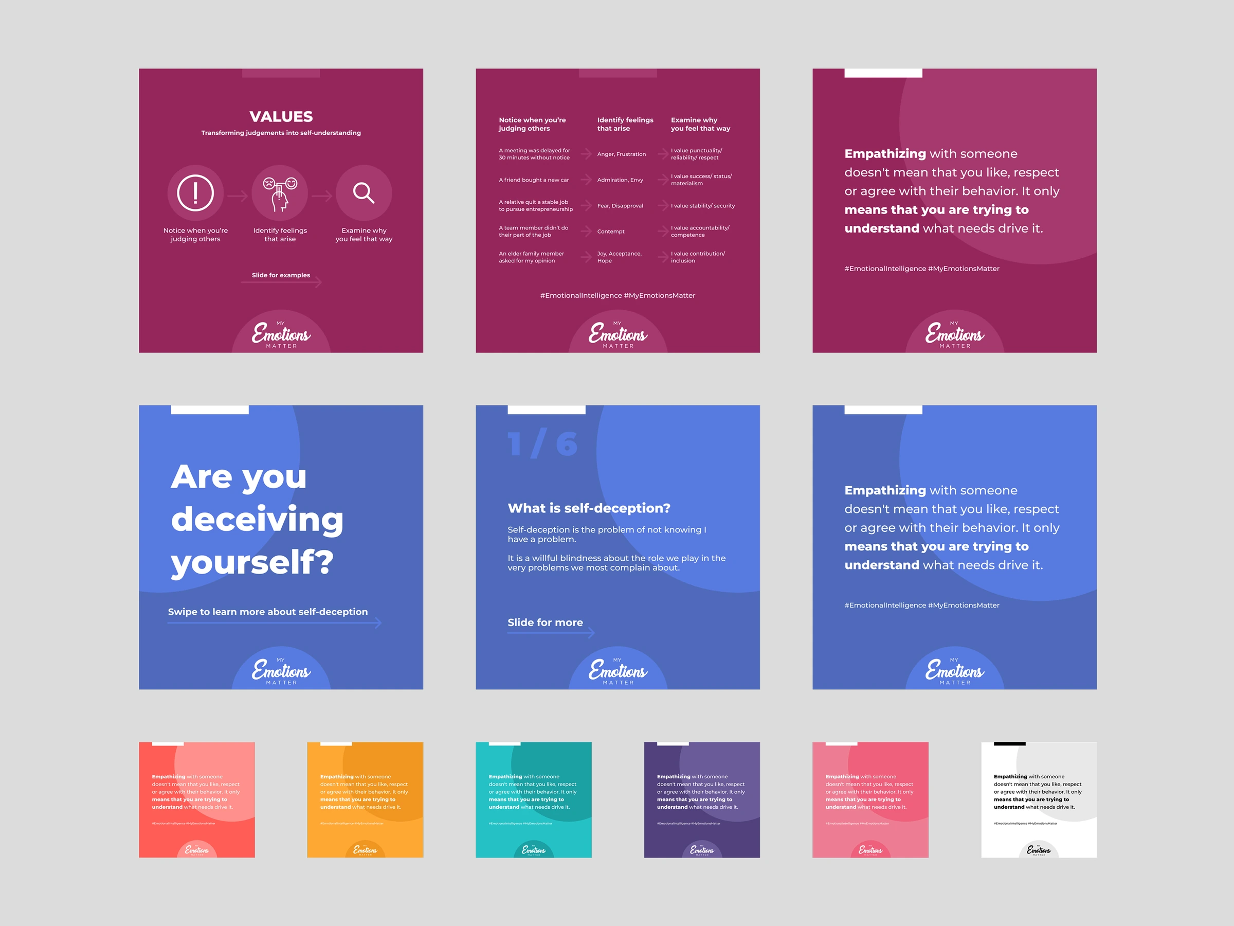
I expanded the site with blogs and resources, so social media content could link to specific sections instead of only the homepage. Then I built a collection of colourful social media templates in Figma, each suited to a different context, so the team could publish without waiting for a designer.

The brand, beyond the website

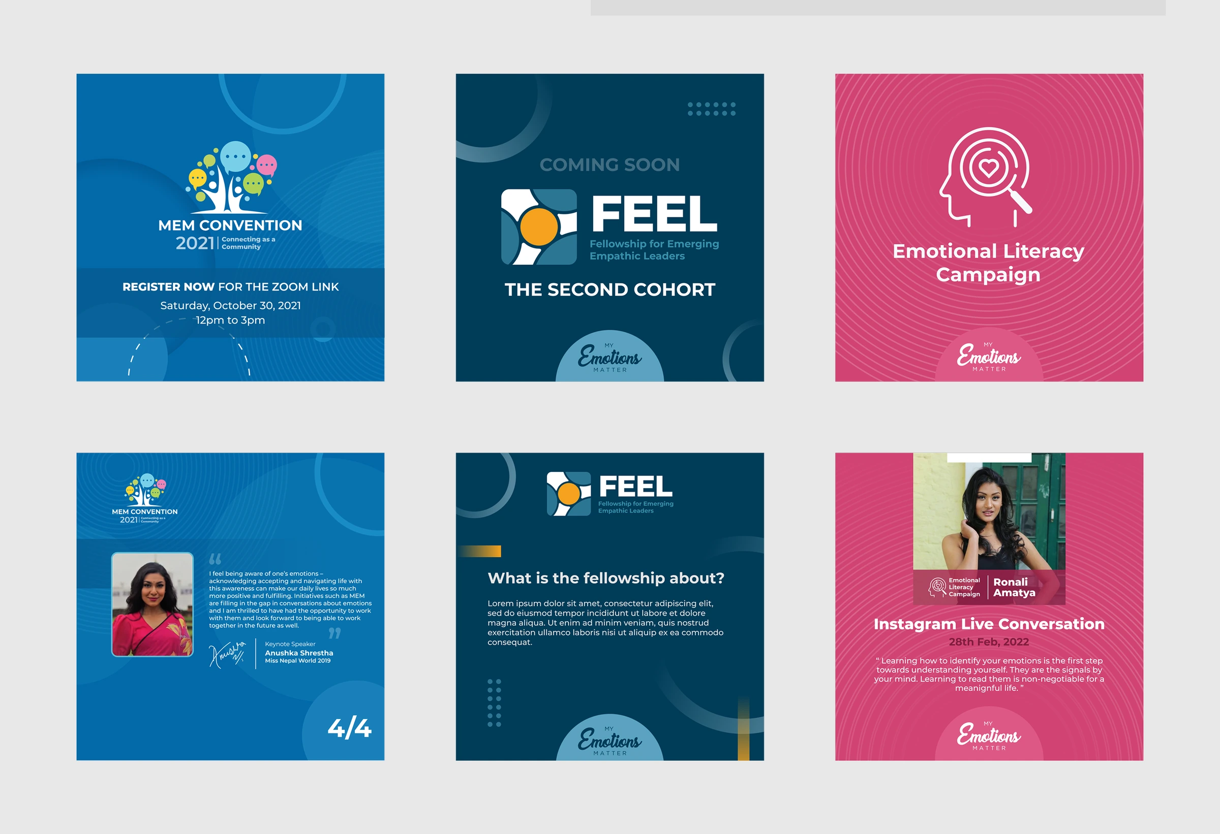
Event and fellowship graphics in three sub-brands

The same thinking carried into guidelines and a new programme.

I created brand guidelines for the company, and the branding for its fellowship programme. Together with the templates, they made the identity something the team could use consistently on their own.

Fewer explanations, better leads

Clients no longer needed the work explained before they could see its value.

After launch, the team reported higher-quality leads, smoother client interactions, less back-and-forth and improved conversion. These are client-reported, not formally measured.

On attribution: the team wrote much of the final copy and built the site. I credit the design directly for the structure, the audience paths and the visual direction.

Clarity is a design decision

The hardest part wasn’t how the site looked, it was deciding what to say first and to whom. A clear problem definition aligned the team faster than any mock-up. Ordering audiences by who buys made trade-offs easy to explain. Serving several audiences with one visual language is still a balance, not a solved problem.