Channel Managers are one of the most crucial tools when running hotels or any lodging-based enterprise that is promoting its products across multiple platforms. An average hotel has its website, promotes its services on various booking platforms, and also takes in-person reservations simultaneously. Acting as a crucial bridge between these various platforms, a Channel Manager is nothing short of the software version of a swiss-knife.
Nepal did not have a channel manager of its own. This means that all the channel managers used in the Nepalese hospitality sector were globally competitive software. We had to create a local offering that was as good, and if not, better than the rest. The main challenge while working on this project was the limited interaction with the actual users. Most of the business correspondence took place with the hotel owners and they were heavily reluctant to share their staff for in-depth user observation or user interviews. Most of the requirements were received based on their pre-existing experience with channel managers that they were using. Another hurdle was the limited timeframe. All of the designs had to be wrapped within three months.
I was the lead creative resource in the branding as well as the UI/ UX process and I

When our access to the user group was limited, we went to where our users went the most. We began with a thorough analysis of our competitor’s applications. A usability-centered deconstruction of the competitor’s applications and rebuilding everything was a complicated but rewarding process.
This was the first step in our design process. We began by jotting down the minute actions available to our users on our competitor platforms. After the deconstruction, they were grouped to plan for the organization of the features and tasks. Since using existing systems as references, we had to be mindful about not borrowing the issues of the existing platforms and only taking what we need. The deconstruction was focused on three key guiding points:
By grouping the minute actions, we were able to narrow things down to five core task groups: business, reservations, channels, timeline, and property along with their respective subgroups.
Card sorting to organize the deconstructed features and tasks
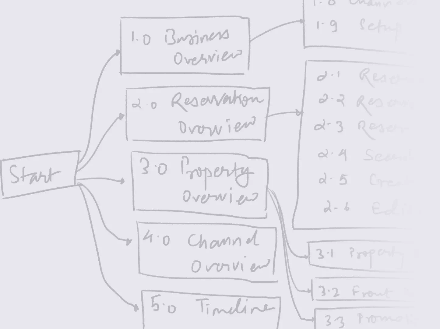
It was obvious pretty early on that the design was going to be huge in terms of the scale of the application. We needed to work on a tight structure or we were bound to be lost sooner or later. Inspired by Data Flow Diagrams, we began by hierarchically numbering the processes. This gave a visual indication of how the application was growing and acted as our guiding map.
Numerically represented hierarchical task structuring
After the core processes were defined, we began working on the task flow. Our key focus was on how the task would start and the logic behind each task We were planning for the data fields that would be collected as well as the various validatory steps conducted by the system. We made sure that our flows were modular i.e. they could be accessed through various branches in the user flow without seeming out of place.
Some task flows that were designed based on key tasks
With the flow in place, we began exploring low-fidelity options for the layout, navigation, and other UI elements. It was important that we kept our minds open and try everything and anything that we could think of. Our low-fidelity explorations also helped us fine-tune our task flow and painted a clearer picture for us to start working on.
Low fidelity exploration for the layout and other UI elements
Once the flow was put down on paper and the wireframes were finalized, it was time to approach the actual interface. It was a basic run-of-the-mill approach that started with translating the low fidelity prototypes into high fidelity mockups, addressing any complications that arose, and translating that to code. A few things that I was proud of:
The application had a wide range of functionality that had to be made available in a user-friendly manner. There were two navigation systems used in the application: a nesting-enabled side navigation drawer, and a scroll supporting tabbed navigation. The navigation drawer enabled moving around between unrelated sections while the tabbed navigation system allowed for navigation between related sections of the same page.
A representation of the navigation system
With an application that was guaranteed to grow bigger than 100+ frames, it was important to have a flexible but well-documented design system. We pain a special focus on the color scheme, grid, UI components, and icon style.
Design system components for the UI elements and the UI layout
With the look and feel of the elements in place, the rest of the design process was a breeze. We started with the categories. We started working on the first feature category and finalized it before starting work on the second category and so on. This allowed the developers to delve completely into the development of one category while the design team worked on another category.
Glimpses of the final UI design
This was one of the first product design initiatives that I lead and I learned a great deal from this experience. Some of the key learning that I am proud of: